


Repeat after me: Design matters
You shouldn’t need a manual to get through an intersection.

I live, as you may have heard, in Westboro. Earlier today I had to drive downtown to rescue two of my favourite teenagers from the teeth of springtime weather and I noticed new signs at the corner of Island Park and Scott. I don’t know how long they’ve been there but they were new to me. I kind of lost my shit there for a moment.
The multi-use pathway we used to have on the north side of Scott was brilliant. You could take it all the way downtown, it was winter-maintained and everything.
And then they fixed it.
I’m sure some people had been requesting improvements because one of the issues with a super-successful path is that it gets used by a bunch of people. Some days there was so much traffic on that MUP that it became slow for cyclists and dangerous for pedestrians.
So they built another one on the south side of the street, divided between a bike lane and a sidewalk. The old one on the north side, instead of being two-way, became one-way to the west, with one lane for bikes and one for pedestrians.
Not that anyone pays attention to the paint on the ground. As a result cyclists still need to swerve around pedestrians and people are going every which way they like.
Oh, and the new path on the south side goes really close to sign posts, so much so that to prevent unfortunate and no doubt painful collisions, the city installed pool noodles around said sign posts. Complete with duct tape.
Hillbilly, much?

The picture above shows the wonderful Hans on the Bike, who collaborated on a great blog post about the Scott St pathway on the Beyond the Automobile website. You should read it.
Anyway, this entire Scott St pathway debacle is driving me up the pool-noodled bend. To me it’s personal because I have an ex who used to do the exact same obnoxious thing. Deny there’s a problem for the longest time. Then agree that OK maybe it could be better but there’s no budget. Eventually money is found and the work gets done but it’s so shoddy and half-assed it’s actually worse than it was back when you were complaining about a crying need for improvements. Ending with: “See, the problem with you is that you’re never happy.”
I left that person. Will I also have to leave the city?
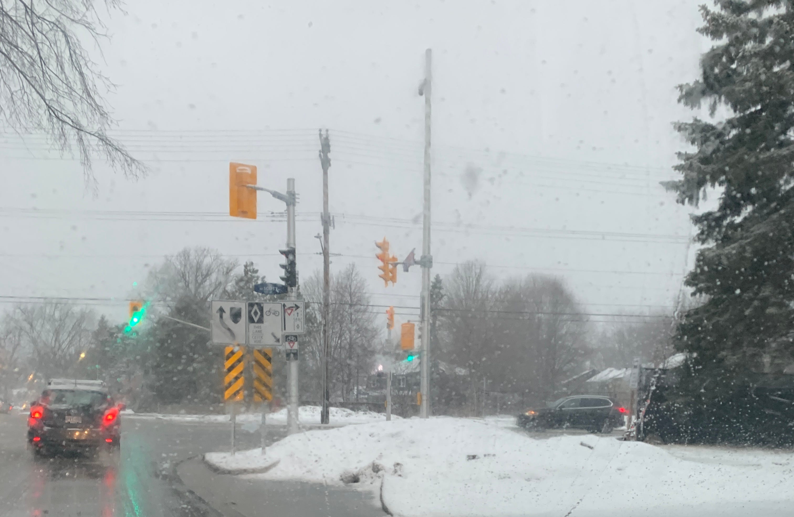
The absolute worst in all of this is the Island Park intersection. They tried to have it be cycling-optimized but, well, let’s just say it didn’t work. The design they used is so unfriendly to human beings that in addition to the cyclist traffic signal they’ve had to add not one, not two, not three, but FOUR signs to tell cyclists to yield to pedestrians, tell drivers to yield to cyclists going through, tell drivers not to take the cycling path and remind driver that by “not taking the cycling path we mean please go around the cycling path.”
As my clever and sharp-witted teenager put it, when you have this many signs at an intersection it becomes an essay.
I love reading essays. I’m also fairly competent at writing them. You know where they don’t belong?
On the roads.
Everyone who’s trained and skilled at design, from architects to graphic designers, will tell you that if you have to explain your design, your design is an abject failure. A successful design should be intuitive. Obvious, even. Bonus point if it’s obvious and beautiful. But it should not need to have five traffic signs to explain to three different kinds of road users how to navigate a fucking intersection.